Website Design
Count Junkula Website Redesign
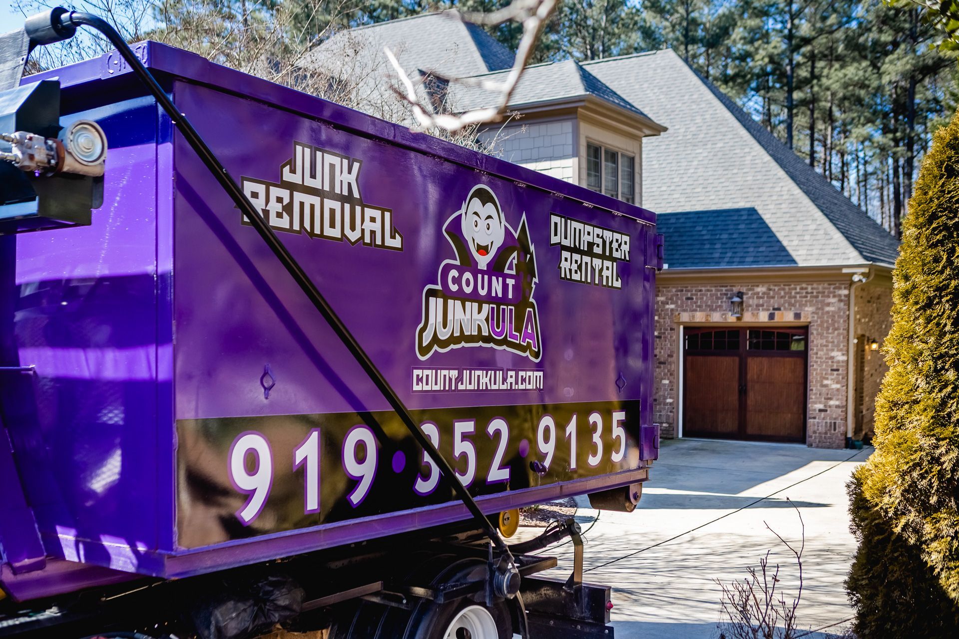
Redesigned the Count Junkula website to simplify navigation, streamline booking, and create a more conversion-focused experience that reflects the brand’s fast, reliable, and user-friendly junk removal service.
Role
UI/UX Designer
Timeline
12 weeks
Tools
Figma, Duda, Adobe Creative Suite
The Problem
The existing Count Junkula website had a cluttered layout, confusing navigation, and overly dense content, making it difficult for users to quickly understand services or take action. Key information, such as pricing, service areas, and booking, was not clearly prioritized, forcing users to search for what they needed and increasing friction throughout the experience. As a result, the user journey felt overwhelming and inefficient, especially for customers looking for a fast, reliable solution. This lack of clarity and streamlined flow created missed opportunities for conversions, as users were more likely to drop off before completing key actions like requesting an estimate or scheduling a service.
Business Goals
- Increase online bookings and estimate requests
- Improve conversion rates by reducing friction in the user journey
- Clearly communicate services, pricing, and service areas
- Strengthen brand credibility and trust through a more polished, professional experience
- Support growth by making the website a primary lead generation tool
User Goals
- Quickly understand what services are offered and if they fit their needs
- Easily find pricing, service areas, and key details without digging
- Book a service or request an estimate with minimal effort
- Feel confident choosing a reliable, trustworthy company
- Complete their task quickly, especially in time-sensitive situations
Research & Insights
A review of the existing website and user journey revealed key friction points that were impacting usability and conversions. The focus was on identifying where users were getting stuck, what information was unclear, and how the experience could be simplified to better support fast decision-making.
Unclear Path to Action
Users were not guided clearly toward booking or requesting an estimate, making key actions harder to complete.
Information Overload
Too much content and lack of hierarchy made it difficult for users to quickly understand services and pricing.
Weak Visual Prioritization
Important elements like CTAs and key details were not visually emphasized, reducing their effectiveness.
Underutilized Trust Signals
While reviews and credibility indicators existed, they were not positioned in a way that built confidence early in the user journey.
The Strategy
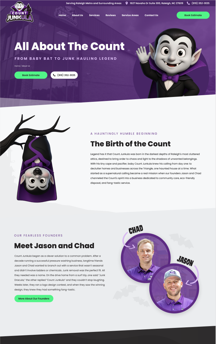
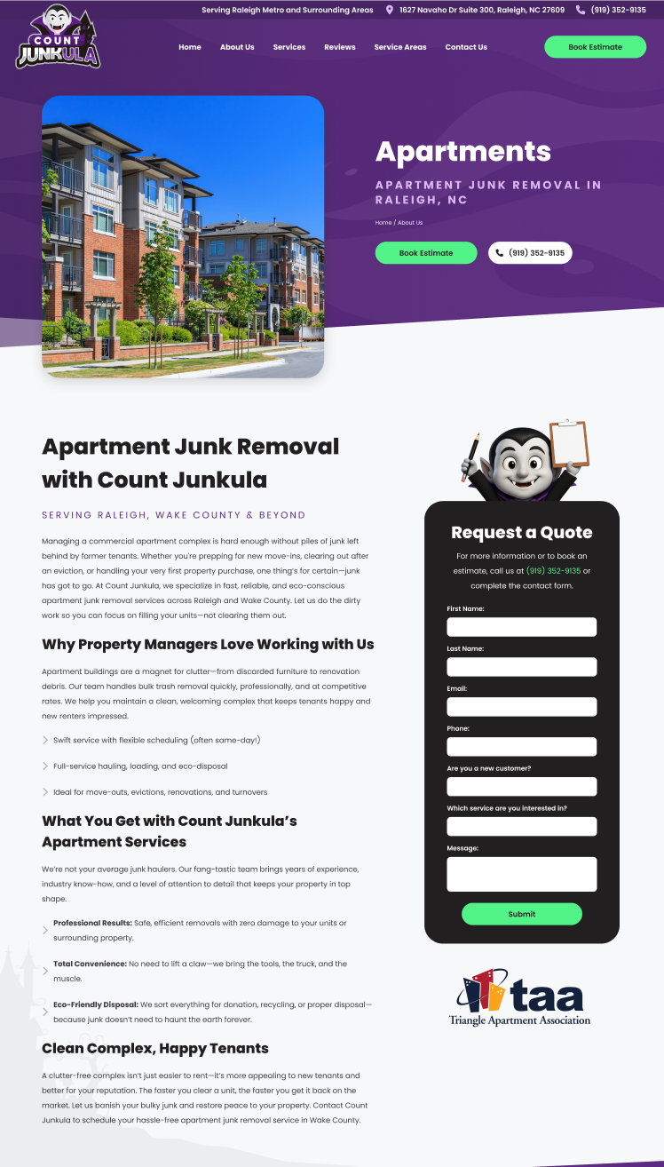
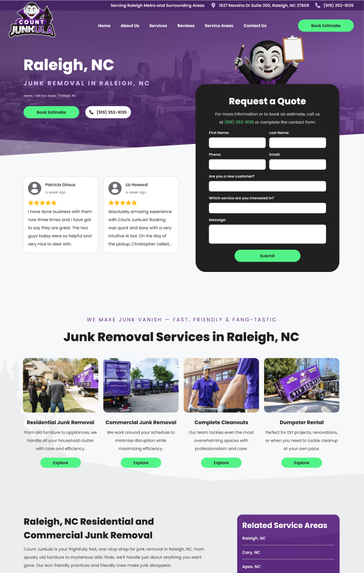
The redesign focused on simplifying the user experience and guiding users toward conversion through clear structure and intentional prioritization. This included streamlining navigation, reducing content clutter, and highlighting key actions like requesting an estimate. The approach emphasized strong visual hierarchy, clearer messaging, and strategically placed trust signals to build confidence early in the user journey. Every design decision was made to help users quickly understand the service, find what they need, and take action with minimal friction.
The Final Solution
The redesigned website delivers a streamlined, user-friendly experience that makes it easier for visitors to understand services, build trust, and quickly request an estimate.
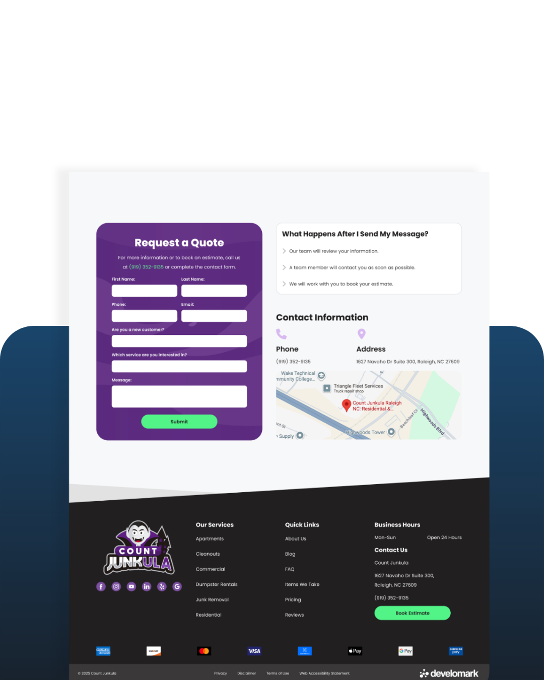
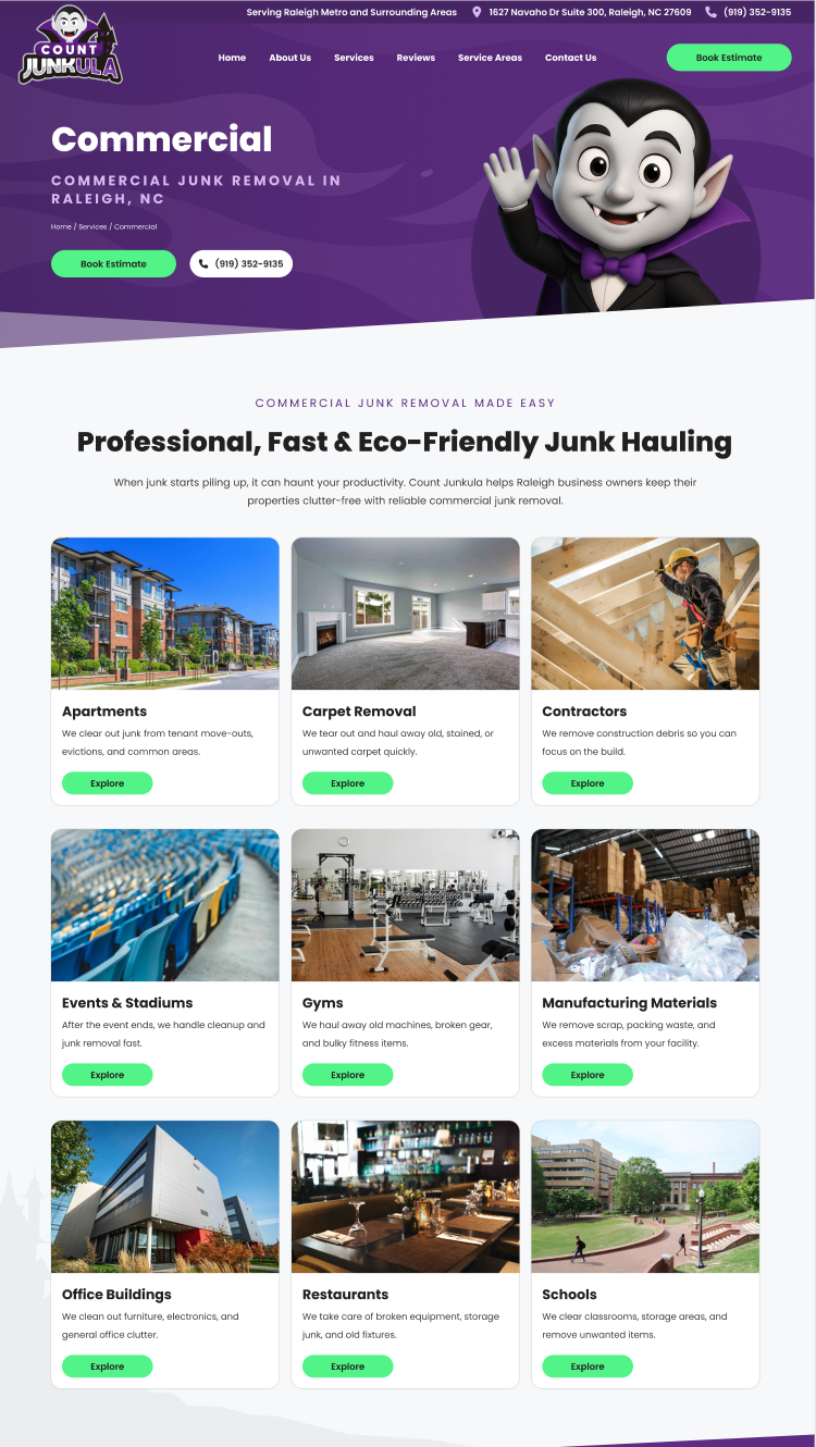
Streamlined Booking Experience
The booking process was simplified to reduce friction and guide users toward requesting an estimate quickly. Clear calls-to-action, improved form structure, and a more intuitive flow made it easier for users to complete key actions without confusion.
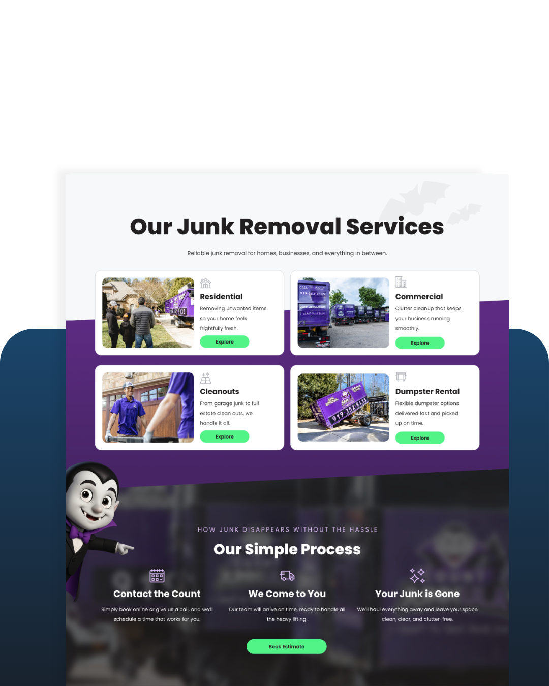
Improved Clarity & Trust
Content was reorganized and prioritized to highlight services, pricing, and key information upfront. Stronger visual hierarchy and strategically placed trust signals, like reviews and credibility indicators, helped build confidence and support faster decision-making.
Creative Project Manager
Develomark
2026–Present
Lead cross-functional web projects from kickoff to launch, managing timelines, client communication, and deliverables. Guide UX strategy and design direction to ensure user-centered, high-performing websites while collaborating with internal teams to streamline processes and maintain quality standards.
Prioritize Clear Calls-to-Action
Primary actions like “Get an Estimate” were emphasized through consistent placement, color contrast, and repetition to guide users toward conversion.
Simplify Navigation & Page Structure
The site architecture was reorganized to reduce cognitive load, making it easier for users to quickly find services, pricing, and key information.
Establish Strong Visual Hierarchy
Typography, spacing, and layout were refined to highlight the most important content first, improving scannability and overall clarity.
Surface Trust Signals Early
Reviews, credibility indicators, and key brand messaging were strategically placed higher on the page to build confidence and reduce hesitation.
Key Design Decisions
Measurable Outcomes
12,028
Page Views Since November 2025
6,995
Unique Visitors Since November 2025
307
Click-to-Calls Since November 2025

Learning & Future Steps
This project reinforced the importance of simplifying complex information and designing with a clear path to action. By focusing on usability, hierarchy, and conversion, I was able to create a more intuitive experience that better supports both user needs and business goals. It also highlighted how impactful small decisions, like CTA placement and content prioritization, can be in driving meaningful results.
Moving forward, I would like to further validate the design through user testing and performance data to measure improvements in engagement and conversion rates. I would also continue iterating on key flows, such as the booking experience, to optimize for speed and ease of use as the business grows.