App Design
MyPlymouth App Prototype
MyPlymouth is a Figma-based mobile app prototype designed to help Plymouth, CT residents easily access local services, stay informed, and engage with their community through a centralized, user-friendly platform.
Role
UX Designer
Timeline
7 weeks
Tools
Figma, Marvel App, paper prototyping (POP method), usability testing methods
The Problem
Residents of Plymouth, CT lacked a centralized, user-friendly way to access town services, information, and community resources, forcing them to navigate multiple disconnected systems and making it difficult to stay informed and complete everyday tasks efficiently.
Business Goals
- Provide a centralized digital hub for town services and communication
- Increase efficiency by reducing manual processes (calls, in-person visits, paperwork)
- Improve community engagement and participation in local events and programs
- Enhance transparency and accessibility of government information and services
User Goals
- Quickly access town services (report issues, apply for permits, pay bills)
- Stay informed with real-time alerts, announcements, and updates
- Easily discover and register for local events and programs
- Find relevant resources (departments, contacts, schedules) in one place
Research & Insights
Through user scenarios, task flows, and usability testing, I explored how Plymouth residents interact with local services and identified opportunities to simplify access, improve clarity, and enhance overall usability. Research showed that users value efficiency, clear navigation, and the ability to complete tasks quickly, especially when accessing time-sensitive information like alerts, events, and permits.
Need for Centralized Access
Users benefit from having all town services, resources, and updates in one place, reducing the need to navigate multiple disconnected systems.
Task Efficiency is Critical
Users were able to complete tasks with minimal difficulty, highlighting the importance of maintaining simple, streamlined flows for actions like reporting issues, registering for events, and applying for permits.
Clear Labeling & Navigation
Some users initially struggled with finding certain features or understanding button labels, indicating a need for more intuitive navigation and clearer wording.
Enhanced Functionality
User feedback revealed opportunities for improvement, such as adding location services, supporting multiple calendar integrations, and improving access to saved applications.
The Strategy
Based on research and usability testing, the strategy focused on creating a centralized, easy-to-navigate experience that allows users to quickly access key services, information, and community resources. This included simplifying navigation, streamlining task flows for actions like reporting issues and registering for events, and improving clarity through better labeling and organization. The goal was to create an intuitive, accessible app that supports efficient task completion and keeps residents connected to their community.
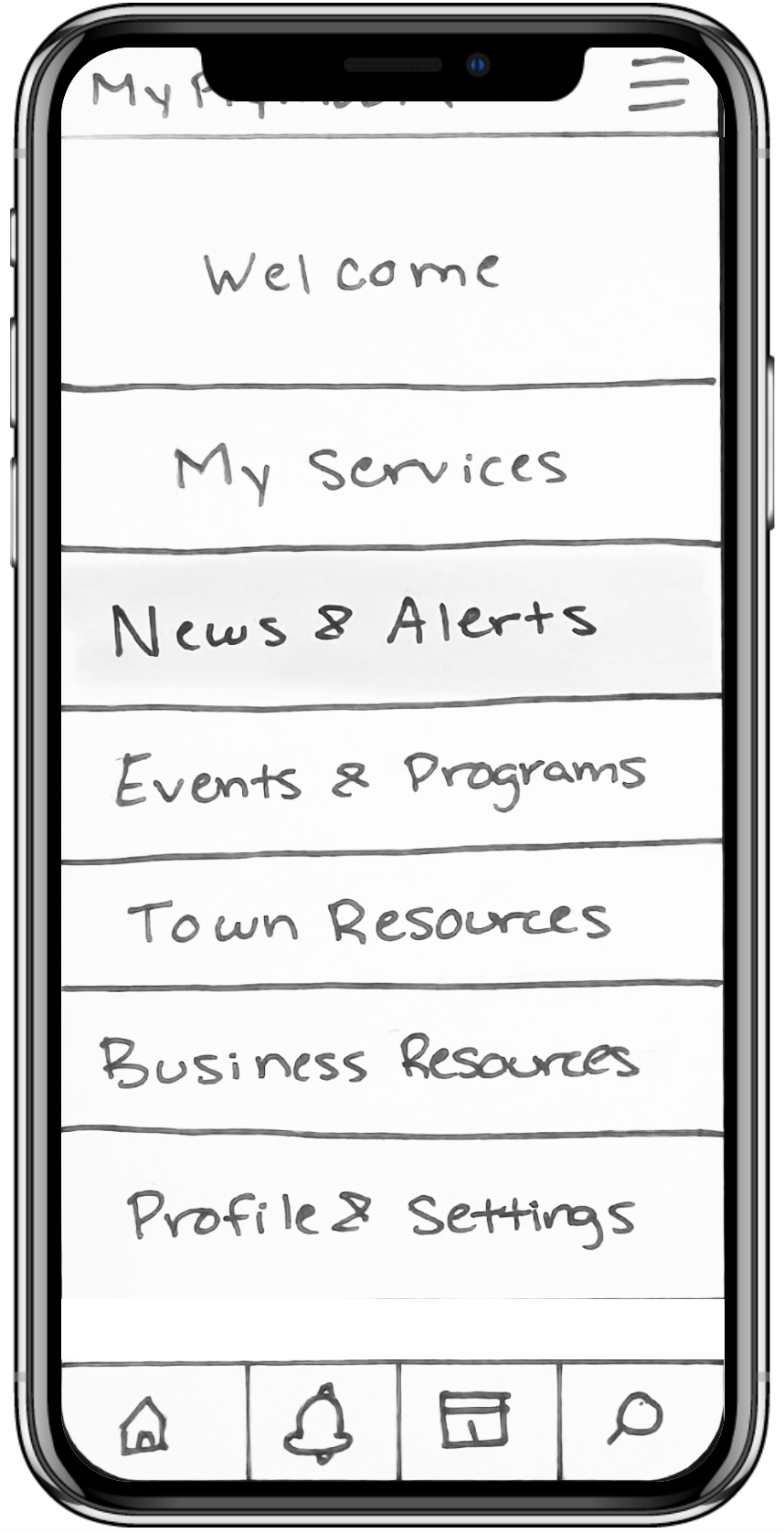
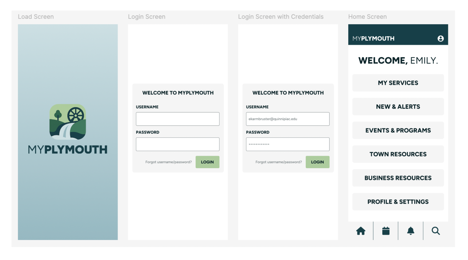
The Final Solution
The final solution is a high-fidelity mobile app prototype designed to centralize town services, improve accessibility, and streamline everyday tasks for Plymouth residents. The app provides a clean, intuitive interface that allows users to quickly report issues, register for events, access alerts, and apply for permits, all within a single, user-friendly platform.
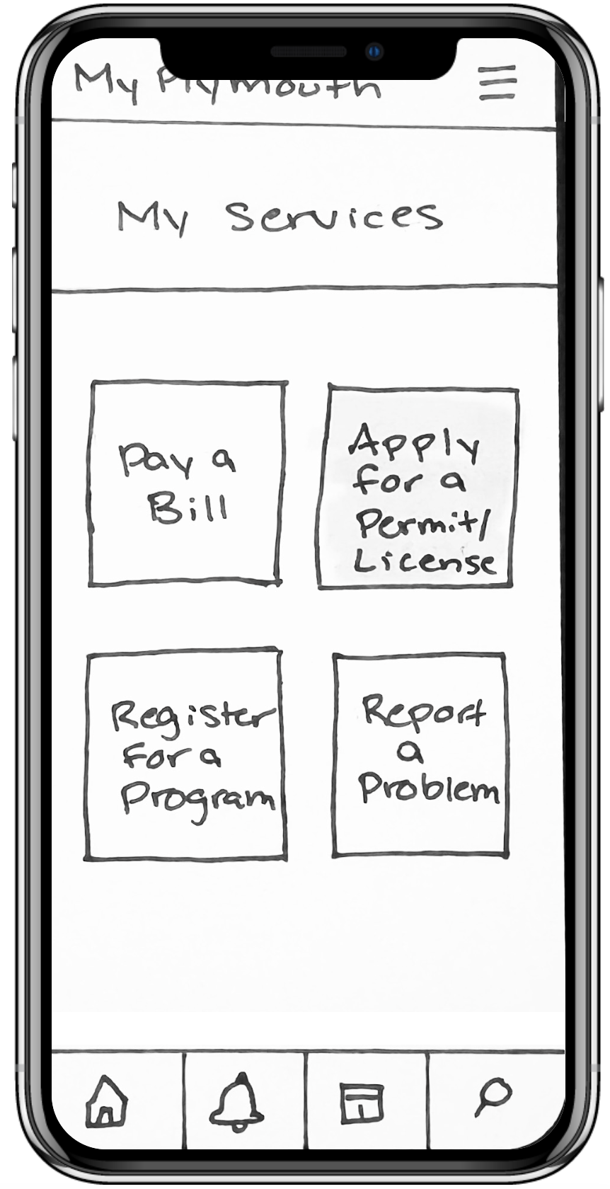
Centralized Service Hub
The app brings together essential town services, such as reporting issues, paying bills, and applying for permits, into one accessible location, reducing the need for users to navigate multiple systems.
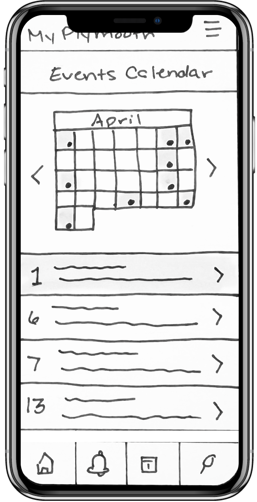
Streamlined Task Flows
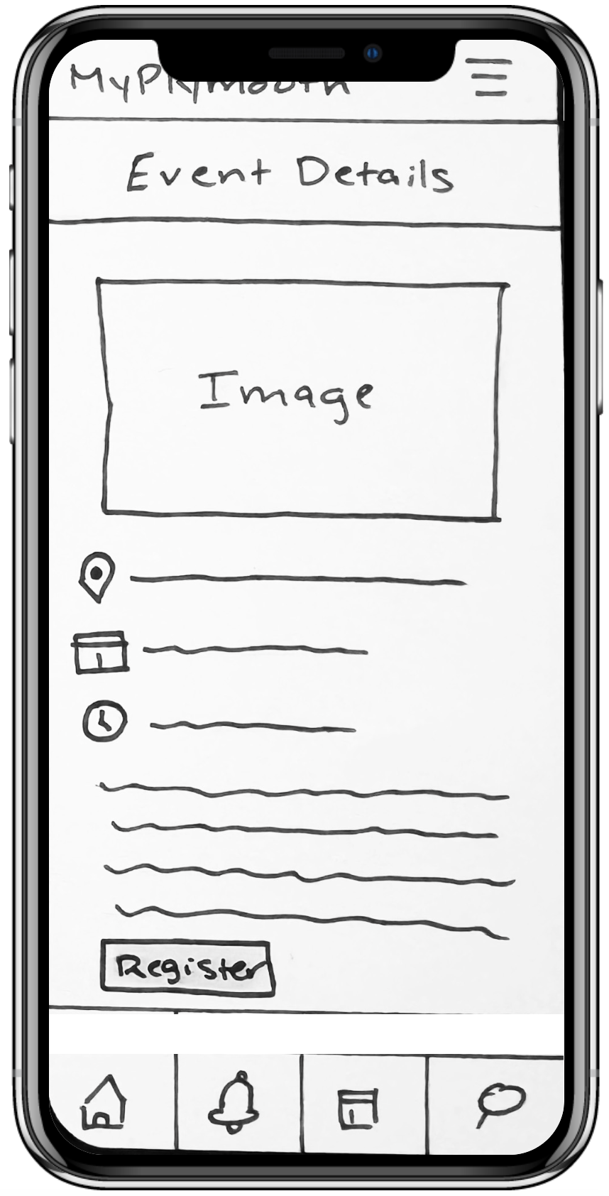
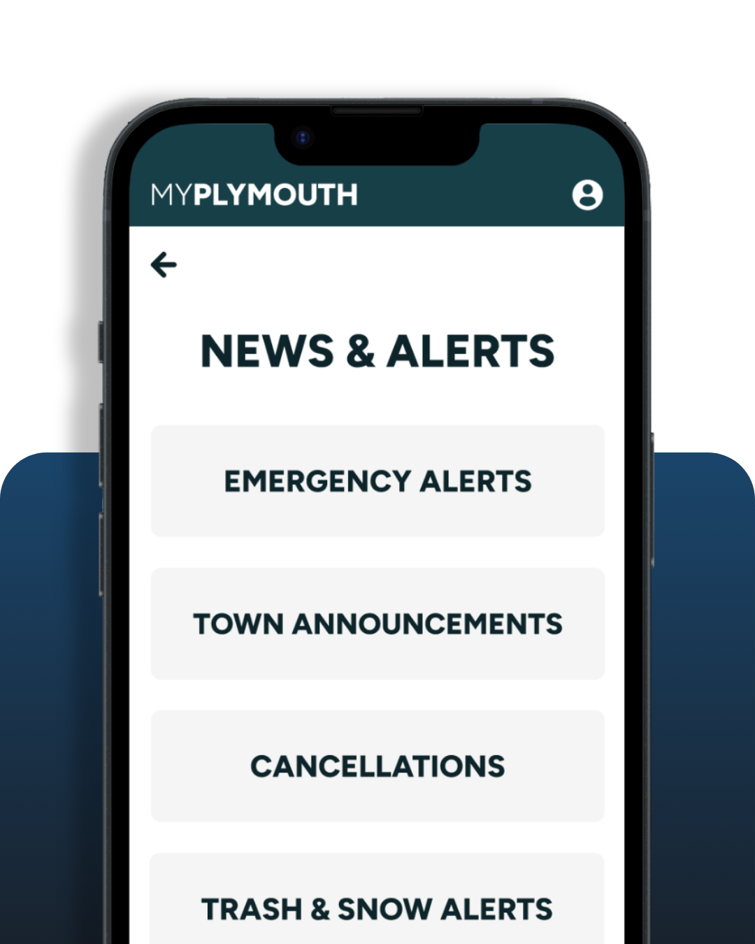
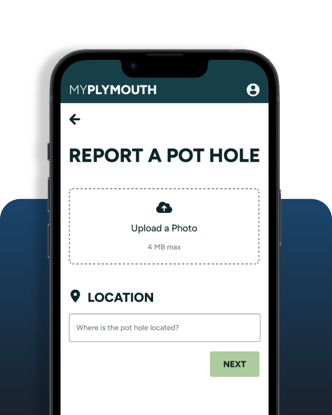
Key actions like registering for events, submitting reports, and accessing alerts are designed with simple, step-by-step flows to ensure efficiency and ease of use.
Creative Project Manager
Develomark
2026–Present
Lead cross-functional web projects from kickoff to launch, managing timelines, client communication, and deliverables. Guide UX strategy and design direction to ensure user-centered, high-performing websites while collaborating with internal teams to streamline processes and maintain quality standards.
Prioritize Task Efficiency
Focus was placed on enabling users to complete key tasks, like reporting issues, registering for events, and applying for permits, as quickly and seamlessly as possible through clear, step-by-step flows.
Centralize Services in One Hub
All major town services and resources were consolidated into a single, easy-to-navigate interface to reduce friction and eliminate the need for multiple disconnected systems.
Simplify Information Architecture
Navigation and content structure were designed to be intuitive and accessible, allowing users to quickly find information such as alerts, events, and town resources.
Design for Clarity & Accessibility
A clean, minimal interface with clear labels and straightforward interactions was prioritized to support a wide range of users, including residents of varying ages and tech familiarity.
Key Design Decisions
Validated Outcomes
2/2 Tasks Completed Successfully
All usability test participants were able to complete core tasks indicating a strong and intuitive user flow.
4 Core User Flows Validated
Key workflows, including reporting a problem, registering for programs, checking alerts, and applying for permits, were tested and refined to ensure usability and clarity.
Actionable UX Improvements Identified
User feedback highlighted opportunities to improve labeling, navigation clarity, and functionality, directly informing refinements to the high-fidelity prototype.

Learning & Future Steps
This project reinforced the importance of designing with a user-first mindset, especially when creating solutions for a broad and diverse audience. I learned how critical information architecture, usability testing, and iterative design are in building an intuitive and accessible experience. Moving forward, I would continue refining the prototype through additional user testing, explore integrations like location services and calendar syncing, and collaborate with stakeholders to bring the product to life and measure its real-world impact.